Gamepoint Performance
Client: Gamepoint Performance is a fitness training program designed for ultimate frisbee athletes. Overall they wanted a redesign of their current website, with a focus on improving the number of sign-ups. They also wanted to improve the automation of the sign-up system.
Overview
Problem: GPP had been struggling with attracting and converting new sign-ups. Users were struggling to both figure out how to sign up and to complete the sign-up process.
Secondary Problem: Users needed to speak directly to a coach to sign up for every level of program, making it more difficult for both the user and the coach to complete the process.
Results: Creation of an automated form that allowed users to find the program the fits their needs and sign-up directly without a coaches help. A Re-design of current website was also completed with a focus on making the sign-up process easy to find.
Approach: Cognitive Walkthrough, IA Diagram, Figma Wireframing and Prototype
Team Members: Nick Simonelli (Software Developer)
My Roles: Researcher, Designer
The Challenge
Create an improved sign-up process that advocates for the user and balances stakeholder requests, while also improving the overall design of the website with efficient changes due to time constraints.
Make a little go a long way.
Research & Prep
Cognitive Walkthrough
Understanding the users
The first thing I like to do for any new project is put myself in the shoes of the user and go through the process myself. I competed a cognitive walkthrough as if I was a user trying to sign-up. My main struggles were finding information about the program (what would I be signing-up for), how to start the sign-up process, what to do to sign-up.
Understanding the current buisness
New users primarily come from word of mouth, players or teammates recommending to each other, often times to train together. Knowing that, we wanted to improve the speed it takes for users to sign up and get access to the app so they can start training.
White boarding and IA Diagram
I worked with the developer to figure out the best way organize all of the questions the stakeholders wanted to be filled out during sign-up, as well as to connect that to the homepage.
Form Design & Prototype
Design goal
Create a more automated sign-up process that is easier for the user to discover and more efficiently guides them through process.
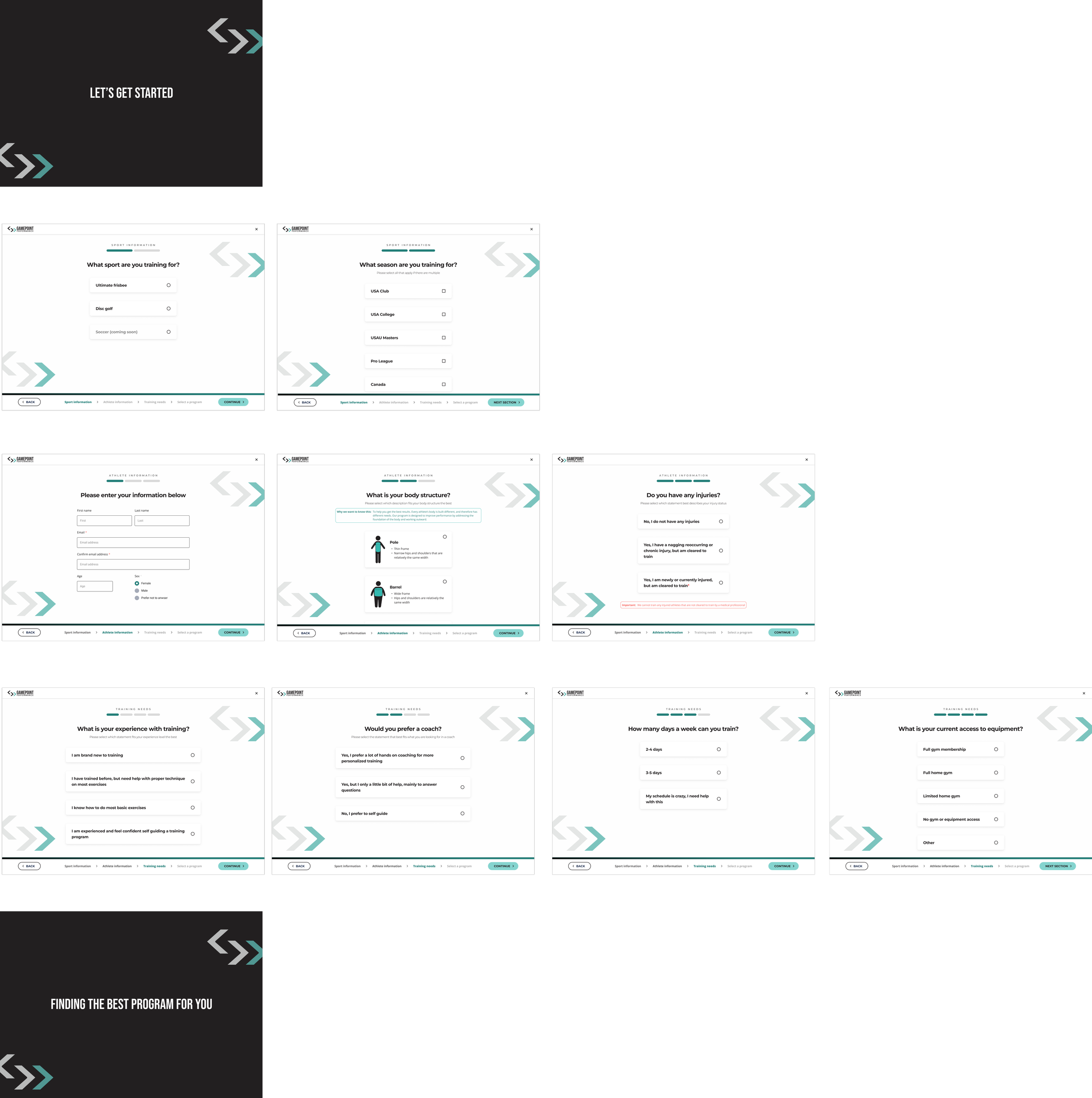
Designing the form
After building out the design system, I used the IA diagram as a guide to build out each corresponding wireframe.
Automation features
This form allows the user to access the app training app faster. These questions used to be asked by coaches manually before the user was given app access. Now it is all automated.
Automatic emails are sent to coaches when there is a new sign-up or if contact info is filled out but not completed.
Breadcrumbs & Navigation
With the large number of questions required for the coaches, it was important to clearly show the user where they were in the process and how much longer they had.
Mainsite Redesign
Connecting the main website to the form
The form doesn’t matter if the user can’t find it. I focused on two main things to help users find and complete the sign-up process.
Main focuses
Consistent sign up buttons throughout the page
Improve user understanding about the sign up process and what is offered in the program
Focus 1: Consistent sign-up buttons
The main function and goal of the website is to get sign ups.
I made the sign up buttons more consistent and placed them throughout key points of the website to make them easier to find.
Original design
New design
Focus 2: Improve user understanding
Throughout the redesign I focused on ways to improve user understanding of how to sign up and about the program itself.
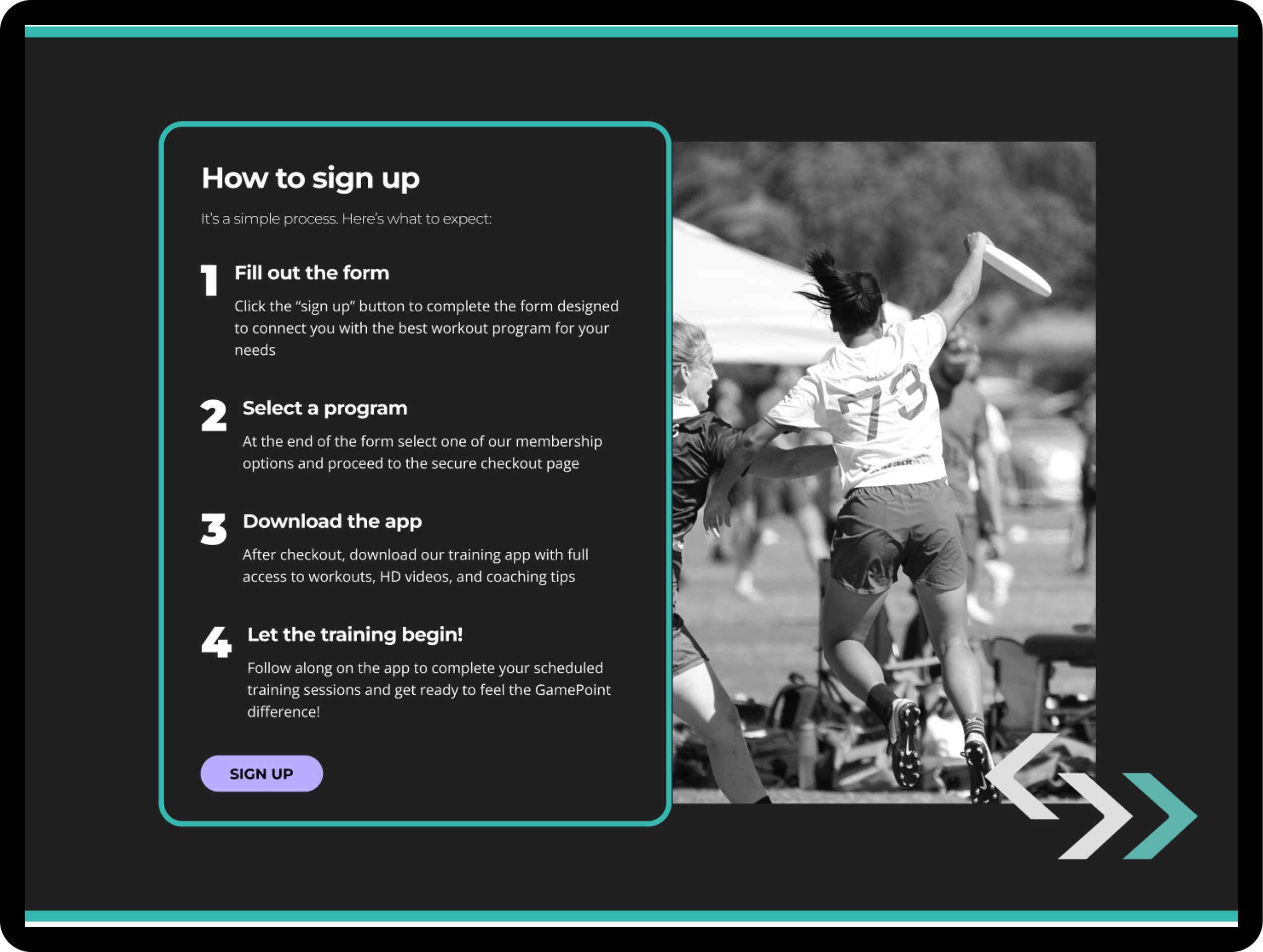
Addition of “How to” section
The goal was to help answer questions the user may have and reduce frustration while signing up.
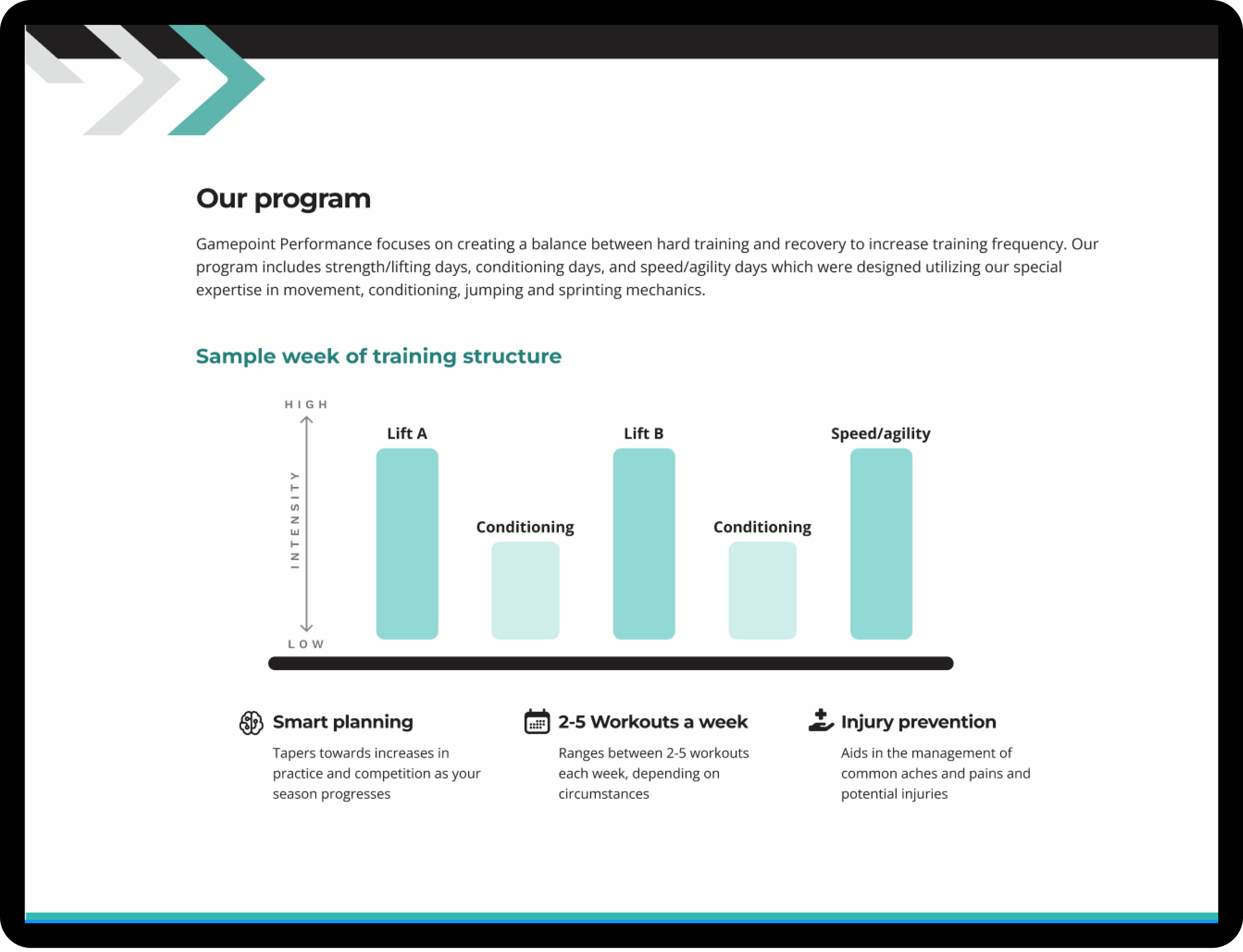
Re-design of info sections
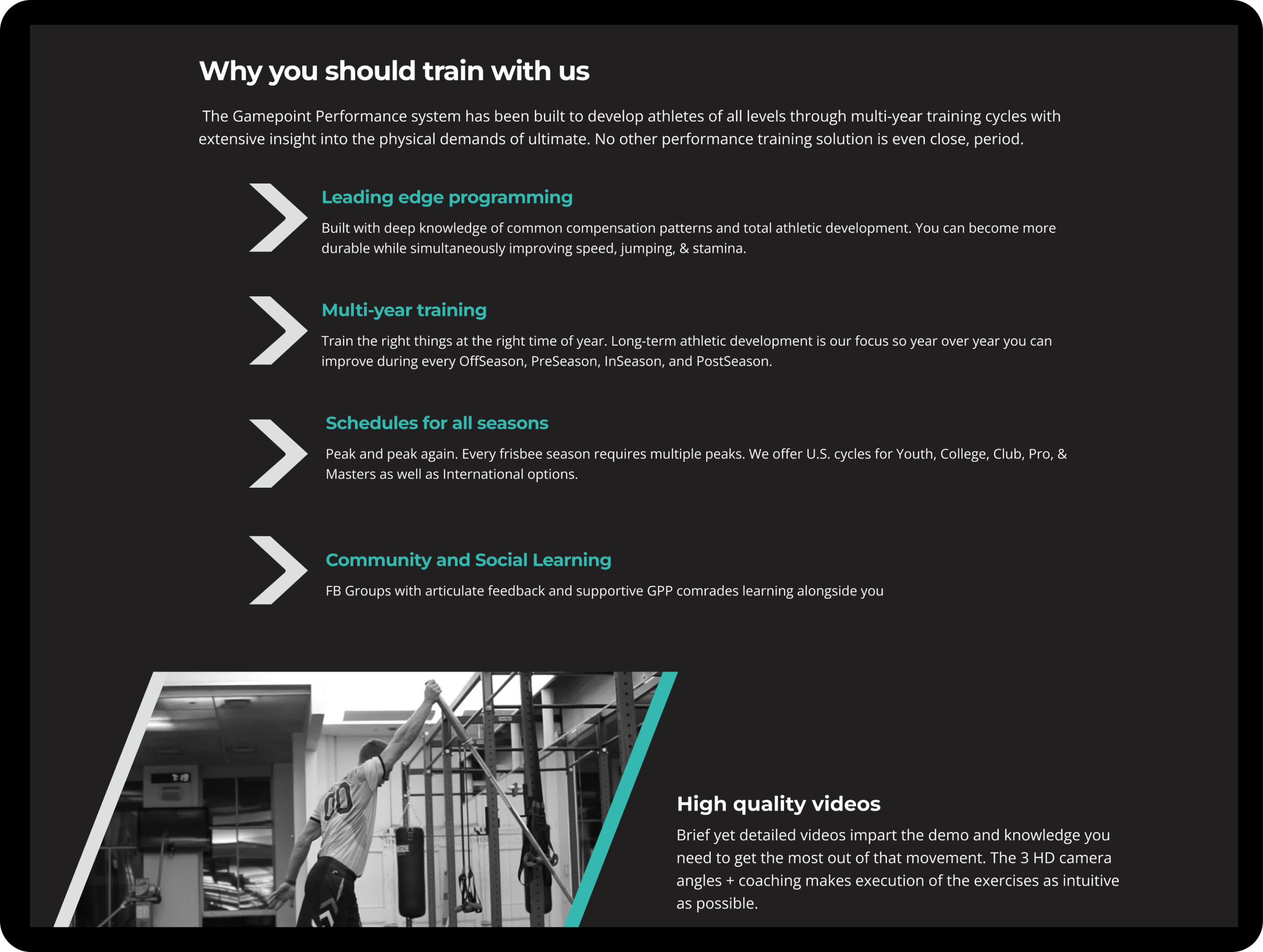
I focused on scannability by reducing word count, adding visuals, and making it more clear what the user gets when signing up.
Informal Testing
A little is better than nothing
Due to time constraints of the project, testing of the product happened within the team by having them use the Figma prototype and by asking a few current GPP athletes their thoughts. A little testing is better than no testing, but I recommended that a more formal test of the form should take place to find improvements.
Final Product
Live Website
I worked directly with the developer throughout the process to help bring this product to life.
Next Steps
Usability testing- Seeing how users interact with the sign-up process and website first hand would be incredibly beneficial. I think there are always ways to improve it, and if we had more time this is the biggest thing I would have wanted to see happen.
Improve on design and SEO- with limited time we were only able to change so much of the original design. I would love more time to get user feedback and find more ways to improve the overall website to help boost sign-ups.
Conclusion
Overall I was very happy with the impact the changes I made had on the overall website and for the sign-up process. Once it went live they immediately had sign-ups and leads at a rate they hadn’t seen in a while. They were also very thankful for it all being automated, meaning less work and time for the coaches to finish getting athletes signed up. Like most project I wish there was more time for testing and trying to make things even better, but I really feel I was able to reach my goal of making the simplest changes that had the most impact.


